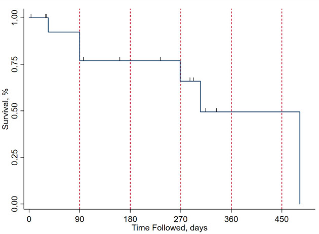
Figure 3.

Kaplan-Meier curve for survival after surgical excision on the present cohort. The x axis represents time from surgical excision in days, with red vertical dashed lines at the 3-, 6-, 9-, 12-, and 15-month marks. The y axis represents the percentage of patients surviving at each time point. Drop points in the curve represent patient mortality and the short vertical lines represent subject concealment from further calculations due to end of follow-up, with patients either lost to follow-up or being operated on recently from the time of analysis.
