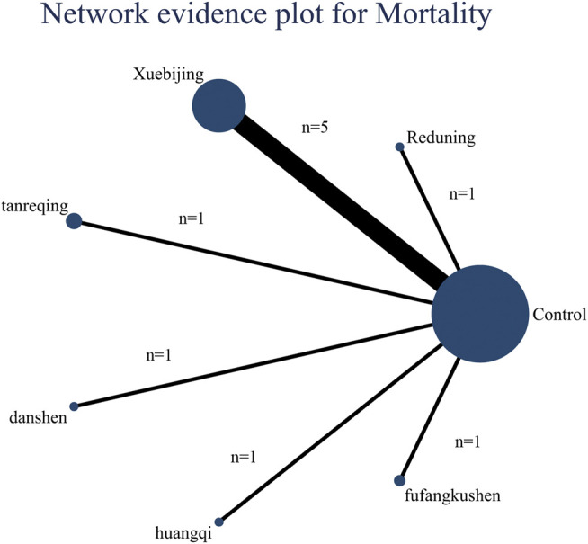
FIGURE 3.

Network evidence plot for mortality: The nodes represent interventions. Larger nodes indicate larger total number of participants in arms. The connections between nodes represent direct comparisons. The width of the connection line is proportional to the number of trials.
