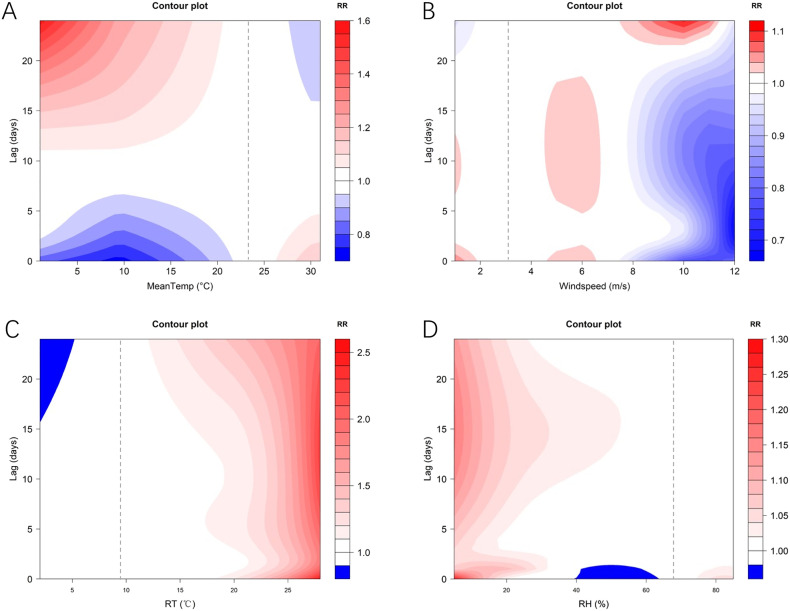
Fig. 8.
Contour plots of the exposure-response relationship for the association between daily new cases of COVID-19 and meteorological variables in the Northern Hemisphere.
A: Mean temperature B: Wind speed: wind speed C: diurnal temperature range D: relative humidity The Y-axis is the lag days ranging from 0 to 24. The X-axis is the range of the observed values of each variable. The color gradient represents the relative risk (RR). The red color gradient represents higher strength of RR, above 1, and the blue gradient represents lower strength of RR, below 1. The white color represents no difference, at RR = 1. (For interpretation of the references to color in this figure legend, the reader is referred to the web version of this article.)

