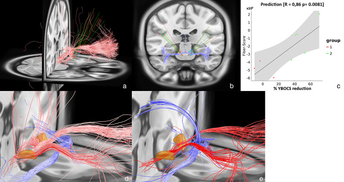
Figure 2.

Left and middle: Positive (a) and negative (b) predicting fibers associated with clinical improvement are shown in red and blue. Right: Correlation between the degree of stimulated positive predictive tracts and percentage Y‐BOCS reduction (c). Gray shaded areas represent 95% confidence intervals. Group 1 and group 2 represent nonresponders and responders, respectively. This analysis is based on a normative connectome. d. The identified predicting fiber tracts as identified by Li et al. as available in Lead‐DBS. The STN is depicted in orange. e. Close‐up of figures (a) and (b) combined. [Color figure can be viewed at wileyonlinelibrary.com]
