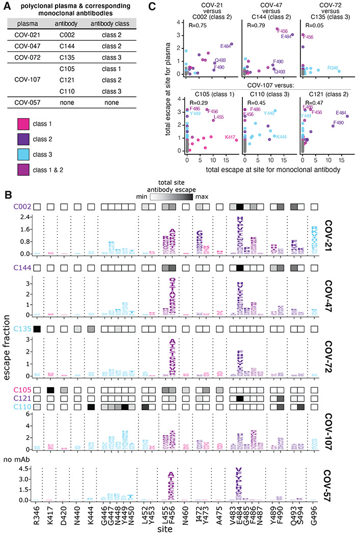
Figure 3. The mutations that reduce binding of polyclonal plasma often differ from those that reduce binding by monoclonal antibodies isolated from the same individual.

(A) Table indicating which plasma and antibodies were derived from the same individual. (B) Escape maps for the polyclonal plasma antibodies, as in Figure 1B. The y-axis is scaled separately for each plasma (see Methods). When there are monoclonal antibodies isolated from the same individual, the total monoclonal antibody escape at each site is shown using the heat maps above the escape maps, with white indicating no effect and black indicating strong escape. (C) Correlation of plasma and monoclonal antibody escape for each plasma / antibody pair from the same individual. Each point in the scatter plots is a site, with the x-axis indicating the total escape at that site for the antibody and the y-axis indicating the total escape at that site for the plasma. Key sites are labeled. Pearson’s R shown above each plot. Colors in B, C reflect antibody classes as in Figure 1.
