. 2021 Feb 22;10:e64207. doi: 10.7554/eLife.64207

Figure 1. Diffusion and localization of Hfq during exponential growth.

(a) Schematic representation of Hfq with three RNA binding faces indicated. (b) A representative example of WT Hfq-mMaple3 in WT rne background in a single cell during exponential growth under no treatment (NT) condition. Nucleoid is stained with Hoechst in live cells. 2D reconstructed image of Hfq-mMaple3 is shown in the black background. Different diffusion trajectories from tracking algorithm are shown in different colors (‘Traj’). One-step displacement (osd) speed map (unit: µm/s) is shown as a scatter plot where different colors represent different speeds at each position, and the white curves represent the nucleoid regions detected by Hoechst staining. The scale bar represents 1 µm. (c) Enrichment of Hfq localization is calculated for cytoplasm, membrane, and nucleoid regions under NT condition. (d) Average osd speed of Hfq within the cytoplasm, membrane, and nucleoid regions under NT condition. Error bars in all plots represent the standard deviation (s.d.) from two experimental replicates, with each data set containing ~20,000 trajectories from ~80 cells.

Figure 1—source data 1. Single cell speed (b) and average enrichment and osd speed (c and d).

Figure 1.

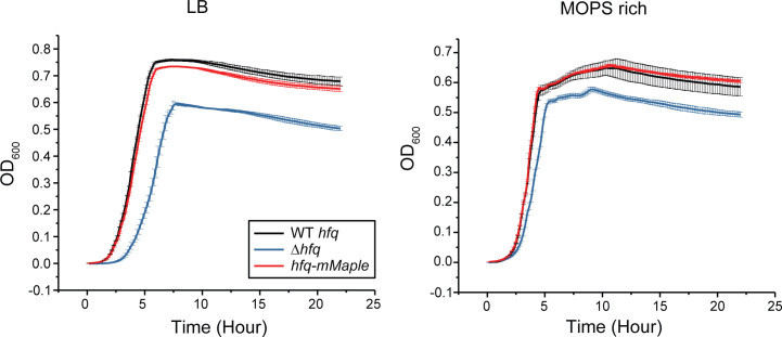
Figure 1—figure supplement 1. mMaple3 tag on Hfq does not affect growth rate.

Figure 1—figure supplement 1.

Growth curves of WT hfq, Δhfq, and hfq-mMaple3 strains grown in LB or MOPS EZ-rich medium containing 0.2% glucose. Data were obtained using a microplate spectrophotometer reader (BioTek). Error bars report the mean and standard deviation (s.d.) from three independent measurements.
Figure 1—figure supplement 1—source data 1. Growth curves.

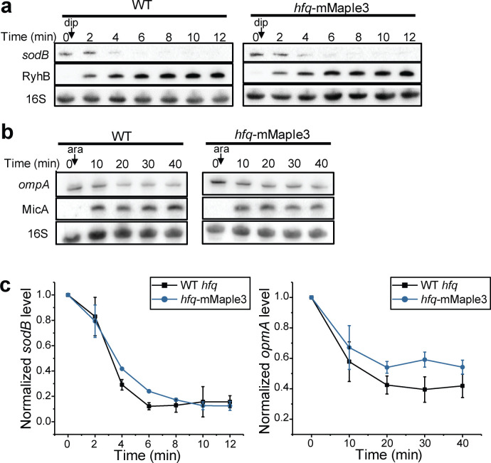
Figure 1—figure supplement 2. mMaple3 tag on Hfq does not affect mRNA degradation by sRNA.

Figure 1—figure supplement 2.

(a) RyhB was induced by addition of 250 µM 2.2′-dipyridyl (dip) in a WT or in an hfq-mMaple3 background when OD600 reached 0.5 in LB medium. At indicated time points, total RNA was extracted. Specific sodB and RyhB probes were used for northern blot analysis. (b) MicA was expressed from pBAD-micA by addition of 0.1% arabinose (ara) in a ΔmicA or in a ΔmicA hfq-mMaple3 background, when OD600 reached 0.5 in LB medium. At indicated time points, total RNA was extracted. Specific ompA and MicA probes were used for northern blot analysis. For a and b, 16S rRNA was used as loading control. (c) Densitometry analysis of sodB and ompA RNA levels obtained by northern blots. Data was normalized to 16S at each time point to eliminate sample loading variation and normalized to the level at time 0 (before induction). Error bars report the mean and s.d. from two to four replicates.
Figure 1—figure supplement 2—source data 1. Densitometry analysis of northern blots (c).

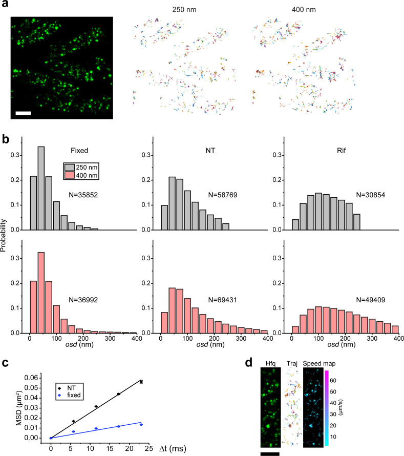
Figure 1—figure supplement 3. Fixed cells as the stationary control for tracking analysis.

Figure 1—figure supplement 3.

(a) A representative area with multiple fixed cells (hfq-mMaple3 in WT rne background) under NT case is shown on the left. Distance cutoff of 250 nm (middle) or 400 nm (right) between neighboring frames is applied to the same image area to generate trajectories. (b) Histograms of one-step displacement (osd) for fixed cell (left), no treatment in live cell (center), and rifampicin treatment in live cell (right) cases, with 250 nm or 400 nm distance cutoff. For each histogram, trajectories from two or three experimental replicates are combined. N represents the total number of trajectories in the histogram. (c) Mean squared displacement (MSD) is plotted against time lag (Δt) for the fixed cells (blue) and no treatment live cells (black), and lines represent the linear fitting. Error bars represent the s.d. from two or three experimental replicates, each containing ~5,000 trajectories from ~100 cells. (d) A representative example of fixed Hfq-mMaple3 in a single cell. 2D reconstructed image of Hfq-mMaple is shown in the black background. Different diffusion trajectories from tracking algorithm are shown in different colors (‘Traj’). Osd speed map (unit: µm/s) is shown as a scatter plot where different colors represent different speeds at each position. The scale bar represents 1 µm.
Figure 1—figure supplement 3—source data 1. Osd speed distribution (b), MSD plots (c), and osd speed of a single cell (d).