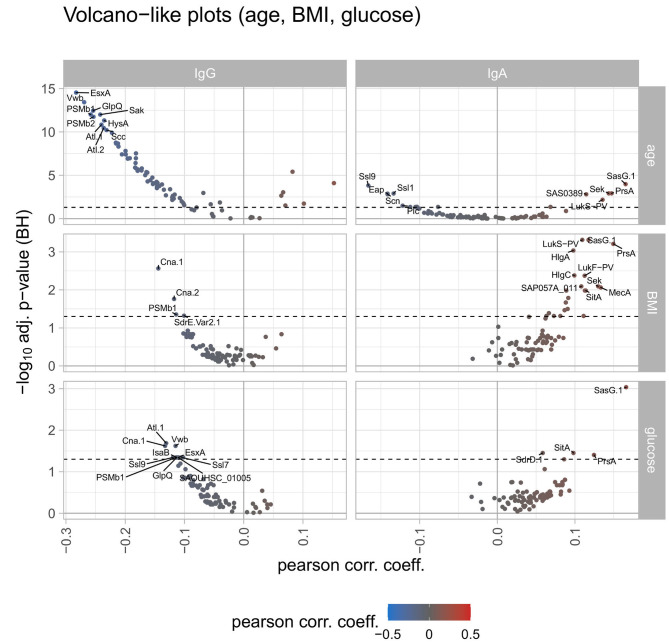
Figure 3.
Volcano-like plots displaying the association of response values of antigens with age, BMI, and serum glucose. For the continuous variables age, BMI, and serum glucose levels a spline regression analysis was conducted followed by linear modeling to derive the Pearson correlation coefficient together with the p-value from the spline analysis. The Benjamini-Hochberg-adjusted p-values are depicted on the y-axis against the Pearson correlation coefficient on the x-axis. The left column shows differences for IgG, the right column for IgA. The log2 ratio of 0 (no difference between the groups) is indicated as a solid vertical line. The significance threshold of 0.05 is indicated as a dotted line. The top 10 antigens showing the strongest associations in each comparison are labeled with the respective antigen's name. The color code displays associations from negative (blue) to positive (red).

