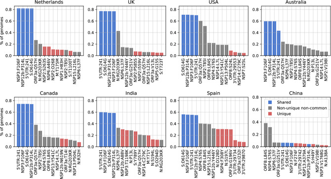
Figure 5.
Total frequency (% of genomes) of the top 15 mutations in the most-sampled countries in our dataset: x-axes are the top 15 mutations and y-axes show the frequency (number of mutations per sample) of mutations. Blue bars are mutations shared across all these countries in the top 15, while the red bars are unique to that one country in the top 15 and the gray bars are non-unique and non-common variants where the mutation is observed in more than one country.

