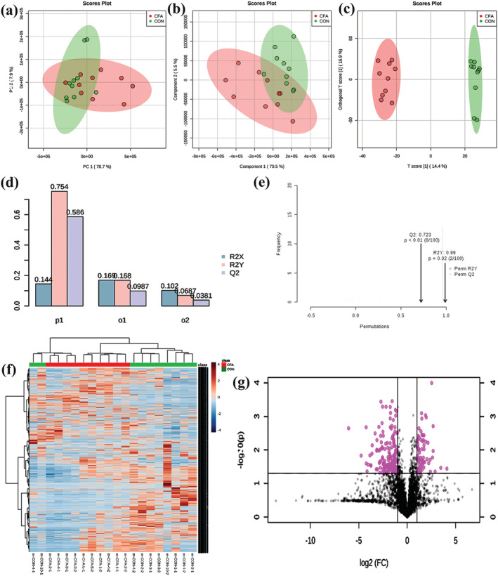
FIGURE 2.

Metabolic profiling analysis: (a) principal components analysis; (b) partial least squares discrimination analysis; (c) orthogonal partial least squares discrimination analysis; (d, e) parametric test. (f) Heat map analysis of metabolites between control group and CFA group (the color scale shows the relative metabolites expression in certain slide: blue indicates low relative expression levels; red indicates high relative expression levels; yellow indicates no change); (g) volcano plot of metabolites between control group and CFA group (red indicates the metabolites expression was significantly down/up‐regulated in CFA group compared with control group; P < 0.05). R 2 X represents the prediction rate of metabolites, R 2 Y represents the prediction rate of grouping, and Q 2 represents the accuracy of model prediction
