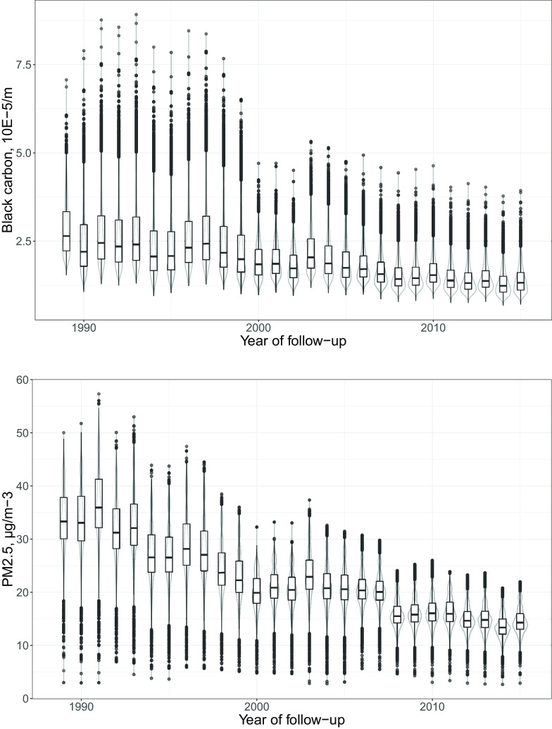
Figure 1.
Black carbon (top) and (bottom) concentrations between 1989 and 2015 at residential addresses of 19,348 participants of the French Gazel cohort. Black carbon () and () are depicted by yearly boxplots in black (minimum, 25th percentile, median, 75th percentile, outliers calculated as 75th percentile plus 1.5 times the interquartile range, and maximum) and violin plots in gray (two rotated kernel density plots depicting the probability of each exposure level and informing on the skewedness of the distribution).

