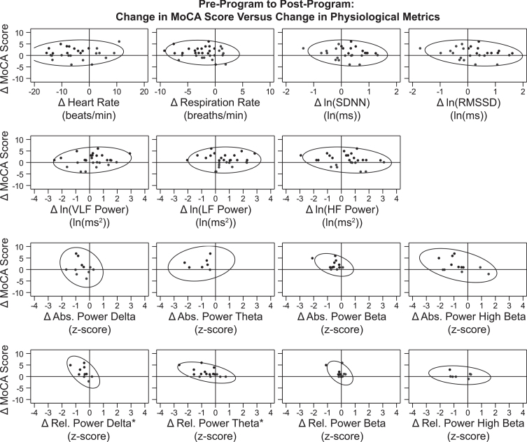
Fig. 6.
Correlation between Changes in MoCA Score and Physiological Metrics over the Treatment Period. Data points for participants’ change from pre-treatment to post-treatment (post minus pre) on MoCA score (Y-axis) versus each physiological metric (X-axis) are graphed. Reference lines are drawn at X = 0 and Y = 0, which divide the graph into quadrants. Points that demonstrate improvement in both graphed measures (where possible) are shown in black, while those that demonstrate no change or decline are shown in gray. For 12 of the 15 graphs, points in a single quadrant are black and points in the other three quadrants are gray, because an improvement was defined for both the X-axis and Y-axis measures. For change in MoCA score, an improvement was an increase in score. For change in heart rate, respiration rate, and all eight QEEG metrics, an improvement was a decrease. For the HRV metrics ln(SDNN) and ln(RMSSD), an improvement was an increase. For the three graphs representing change in ln(VLF power), ln(LF power), and ln(HF power), two quadrants (top left and top right) contain black points and two quadrants (bottom left and bottom right) contain gray dots because an improvement in the X-axis measure was not specifically defined during normal breathing conditions. 90% prediction ellipses are also graphed to aid in relationship visualization. The two graphs representing change in relative power of delta and relative power of theta (the bottom left panels) are indicated with an * symbol because there was a significant linear correlation found between change in MoCA score over the treatment period and change in the physiological metric (values from Table 5). In both cases, the association between these variables was a negative linear correlation. This indicates that the increase (improvement) in participants’ MoCA scores over the treatment period was associated with a decrease (improvement; closer to z = 0) in these QEEG |z-scores|.

