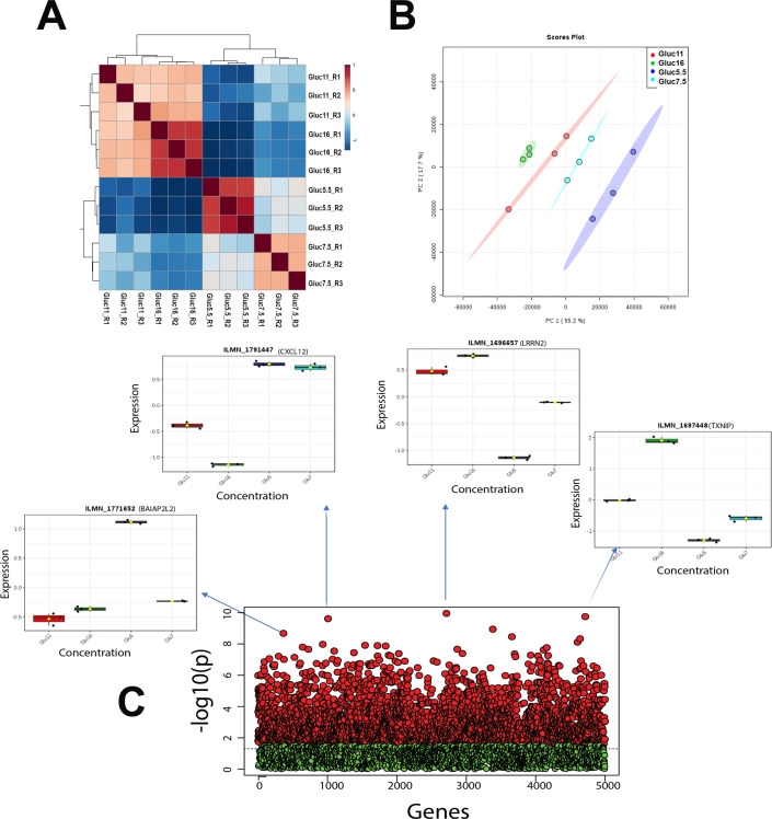
Fig 1. Cluster analysis.
(A) Hierarchical cluster analysis and heat map of correlation; (B) Principal component analysis (PCA), between the replicates and different concentration using gene expression dataset. (C) ANOVA and post-hoc analysis test results. Red and green point represents the probes with below and above adjusted p-value (FDR) cutoff 0.05. X axis represents number of genes; Y axis represents negative adjusted p-value (FDR). Boxplots of top four probes (genes) are shown as an example to demonstrate the outcome variation, where X axis represents different concentrations; Y axis represents probe (gene) expression.

