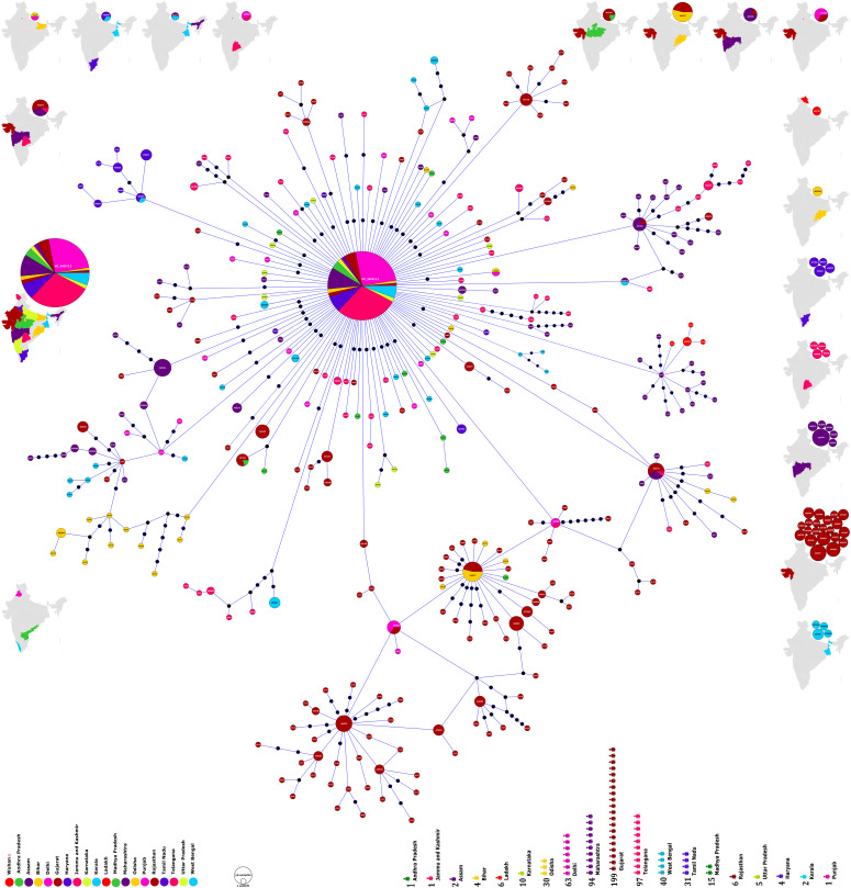
Figure 1. Phylogenomic geographic (phylo-geo) network of SARS-CoV-2 genomes from India.
The nodes represented by circles have been named after the Accession Numbers of the defining sequences representing a particular cluster. The diameter of the circle corresponds to the number of sequences present therein. Thus, a bigger circle will imply more sequences. The different states of India have been represented by color coding and the number of sequences from each state used in the study has been shown in the lower panel of the figure. The distribution of haplogroups across different states is shown in the maps on the periphery such that haplogroups present only in one state are in the maps on the right side. Maps on other sides include haplogroups present in more than one state. Maps have been generated and powered by Bing (Geo Names; Microsoft, TomTom) through MS Excel 2019.

