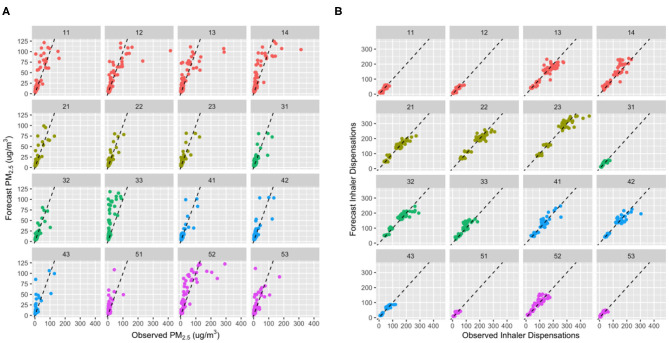
Figure 5.
Scatter plots showing the day0 (i.e., today) agreement between observed and forecast values for (A) fine particulate matter (PM2.5) and (B) inhaler dispensation counts for each of the 16 Health Service Delivery Areas (HSDAs). The points are color coded to group HSDAs by health region, and each plot shows a dashed 1:1 line for reference. For (B), differences in population sizes between the HSDAs are made evident by differences in the range of inhaler dispensations counts. Bi- or tri-modal distributions in the larger HSDAs are due to differences between weekdays and weekends, when many pharmacies are closed.

