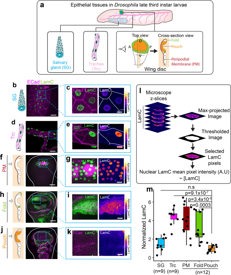
Fig. 1. LamC levels vary across different epithelial tissues.
a Schematic showing different epithelial tissues in Drosophila. b LamC in salivary glands. Image of trachea showing E-Cad (magenta) and LamC (green). c Enlarged image of the region marked by the blue ROI in (b). Left panel shows the merge of E-Cad and LamC. Right panel shows the color-coded LamC intensity. Solid white lines represent cell boundaries. d LamC in trachea. Image of salivary gland showing E-Cad (magenta) and LamC (green). e Enlarged image of the region marked by the blue ROI in (e). Left panel shows the merge of E-Cad and LamC. Right panel shows the color-coded LamC intensity. Solid white lines represent cell boundaries. f LamC in trachea. Image of PM showing E-Cad (magenta) and LamC (green). g Enlarged image of the region marked by the blue ROI in (f). Left panel shows the merge of E-Cad and LamC. Right panel shows the color-coded LamC intensity. h LamC in the fold. Image of fold showing E-Cad (magenta) and LamC (green). i Enlarged image of the region marked by the blue ROI in (h). Left panel shows the merge of E-Cad and LamC. Right panel shows the color-coded LamC intensity. j LamC in the pouch. Image of pouch showing E-Cad (magenta) and LamC (green). k Enlarged image of the region marked by the blue ROI in (j). Left panel shows the merge of E-Cad and LamC. Right panel shows the color-coded LamC intensity. l Schematic showing the estimation of LamC levels in the nucleus of epithelial tissues. m Box-plot showing the normalized levels of LamC in the epithelial tissues. Normalization is performed with respect to the levels in the pouch. The sample number, n represents the number of biologically independent tissue samples. One-way ANOVA was performed to estimate p values. The p values are shown in comparison to LamC levels in the pouch. P values are indicated in the respective plots and n.s represents the differences are not significant. Scale bar in overview images (b, d, f, h, j), 25 µm. Scale bar in enlarged images, 15 µm. In the box-plot, horizontal line represents the median of the data, lower and upper bounds of the box represent the 25th and 75th percentile of data, and the whiskers represent the minimum and maximum of the data. The scattered point on the box represents the actual data points.

