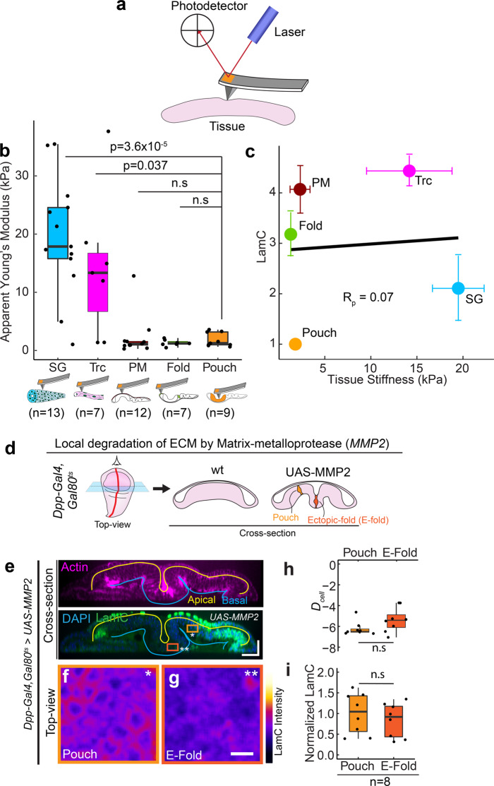
Fig. 3. LamC levels do not correlate with epithelial tissue stiffness and ECM levels.
a Schematic showing the measurement of tissue stiffness using atomic force microscope indentation. b Box-plot showing tissue stiffness (in kPa) for different Drosophila tissues. The sample number n represents the number of biologically independent tissue samples analyzed. c Scatter plot between tissue stiffness and LamC levels in epithelial tissues. Each point represents the average value of tissue stiffness and LamC levels in a tissue. Solid black line shows the linear fit to the data. Pearson’s correlation coefficient, Rp is 0.07. d Schematic showing the local degradation of ECM by overexpression of MMP2 using Dpp-Gal4. The left panel shows the top-view of the wing disc and the right panel shows the cross-section view of the wt wing disc and wing disc expressing UAS-MMP2. e Cross-section through the DV boundary of the wing disc expressing UAS-MMP2 by Dpp-Gal4. The upper panel shows actin (magenta), and the lower panel shows the merge between LamC and DAPI. Solid yellow line shows the apical surface of cells, and the blue line shows the basal surface. Scale bar along both axes, 25 µm. f, g Color-coded LamC images of the regions shown in (b). The pouch region is shown by the light orange ROI and single asterisk, and the ectopic fold (E-fold) region is shown by the dark orange ROI and double asterisk. Scale bar, 5 µm. h Box-plot showing Dcell in wing pouch and E-fold. i Box-plot showing normalized LamC in the pouch and the E-fold. The sample number, n represents the number of independent tissue samples. Normalization is done with respect to the pouch. The p values between two samples are estimated with a two-sided Student’s t-test and between multiple samples by one-way ANOVA. The p values in (b) are shown in comparison to the levels of collagen IV in the wing pouch. P values are indicated in the respective plots and n.s represents that the differences are not significant. In the box-plot, horizontal line represents the median of the data, lower and upper bounds of the box represent the 25th and 75th percentile of data, and the whiskers represent the minimum and maximum of the data. The scattered point on the box represents the actual data points.

