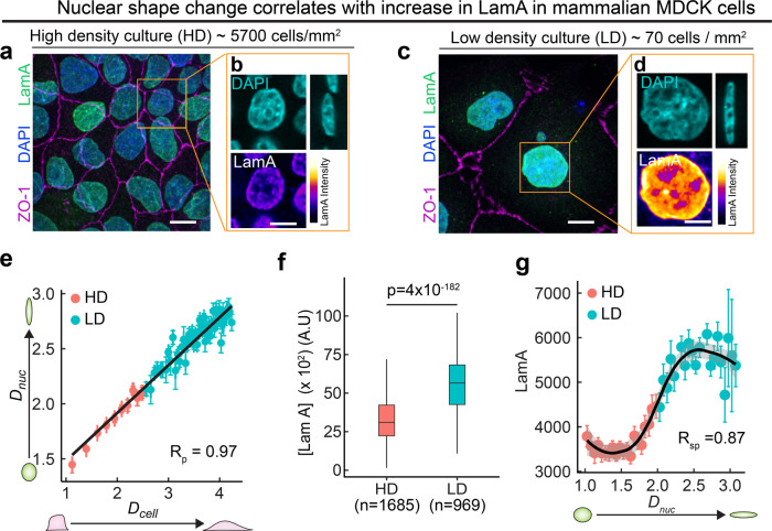
Fig. 6. Regulation of Lamin A/C by apico-basal cell compression is also observed in mammalian epithelial cells.
a Image showing high-density culture of 5700 cells/mm2. Tight junction protein ZO-1 is shown in magenta, Lamin A in green, and DAPI in blue. Scalebar, 15 µm. b Enlarged images of the region shown by the orange ROI in (h). DAPI is shown in blue and Lamin A is shown in color-coded intensity. Scale bar, 10 µm. c Image showing low density culture of 70 cells/ mm2. Tight junction protein ZO-1 is shown in magenta, Lamin A in green, and DAPI in blue. Scalebar, 15 µm. d Enlarged images of the region shown by orange ROI in (j). DAPI is shown in blue, and Lamin A is shown in color-coded intensity. Scale bar, 10 µm. e Binned scatter plot between Dcell and Dnuc generated by binning Dcell in bins of 0.07. Each point in the plot represents mean value of Dcell and Dnuc in the bin. The red points represent data from HD culture and cyan points represent data from LD culture. The data are presented as mean ± S.E.M. Solid red line represents the linear regression to the data. Pearson’s correlation coefficient Rp is 0.97. f Box-plot showing LamA in high density (HD) and low density (LD) cultures. The sample number, n represents the number of cells analyzed over 3 independent biological replicates. g Binned scatter plot between Dnuc and LamA intensity generated by binning Dnuc in bins of 0.06. Each point in the plot represents mean value of Dnuc and LamA in the bin. The red points represent data from HD culture and cyan points represent data from LD culture. The data are presented as mean ± S.E.M. Solid black line represents the LOESS regression to the data. Spearman’s rank correlation coefficient Rsp is 0.87 In the box-plot, horizontal line represents the median of the data, lower and upper bounds of the box represent the 25th and 75th percentile of data, and the whiskers represent the minimum and maximum of the data. The scattered point on the box represents the actual data points. p values are estimated by two-sided Student’s t-test and the p values are indicated in the respective plots.

