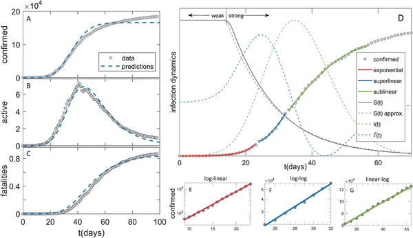
Figure 1.

Comparison of the model (dashed blue curves) with the data in the case of Germany (grey circles) for A) confirmed case counts, B) active cases, C) fatalities. D) Exponential, superlinear, and sublinear fit to confirmed case data, is shown. Arrows “weak” and “strong” indicate, respectively, the regions with a small and large magnitude of social distancing. The full grey curve denotes susceptibles (), where the dashed grey curve shows an approximation to . The dashed green curve denotes the number of infectious cases (), where the dashed blue curve is , whose maxima indicate inflection points. The confirmed case counts in the three regimes are shown on E) log–linear, F) log–log and G) linear–log scale.
