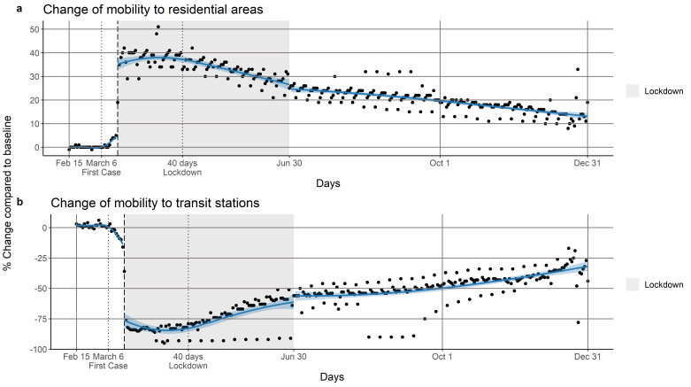
Figure 5.
Panel (a) shows the percentage change in community mobility to residential areas before, during and after the lockdown period. Panel (b) shows the percentage change in community mobility to transit stations before, during and after the lockdown period. In both panels, the grey area represents the lockdown. The first vertical black dotted line corresponds to the first confirmed case and the second dotted line the 40th-day of the lockdown. The vertical black dashed line marks the beginning of the lockdown (March 16, 2020). The solid blue line shows a LOESS smoother with bandwidth = 0.6 and the blue shading corresponds to the pointwise 95% confidence limits for the smoothed line.

