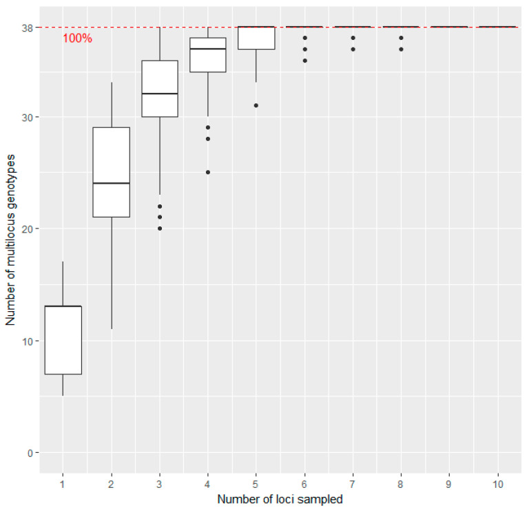
Figure 1.
Genotype association curve for SSR analysis of sweet cherry accessions: The horizontal axis represents the number of SSR loci randomly sampled from the dataset, while the vertical axis shows the number of Multilocus Genotypes (MLGs) observed. The red dashed line represents 100% of the total MLGs observed in the data set. The plateau is reached with five loci sampled, and variance decreases to a minimum with six loci.

