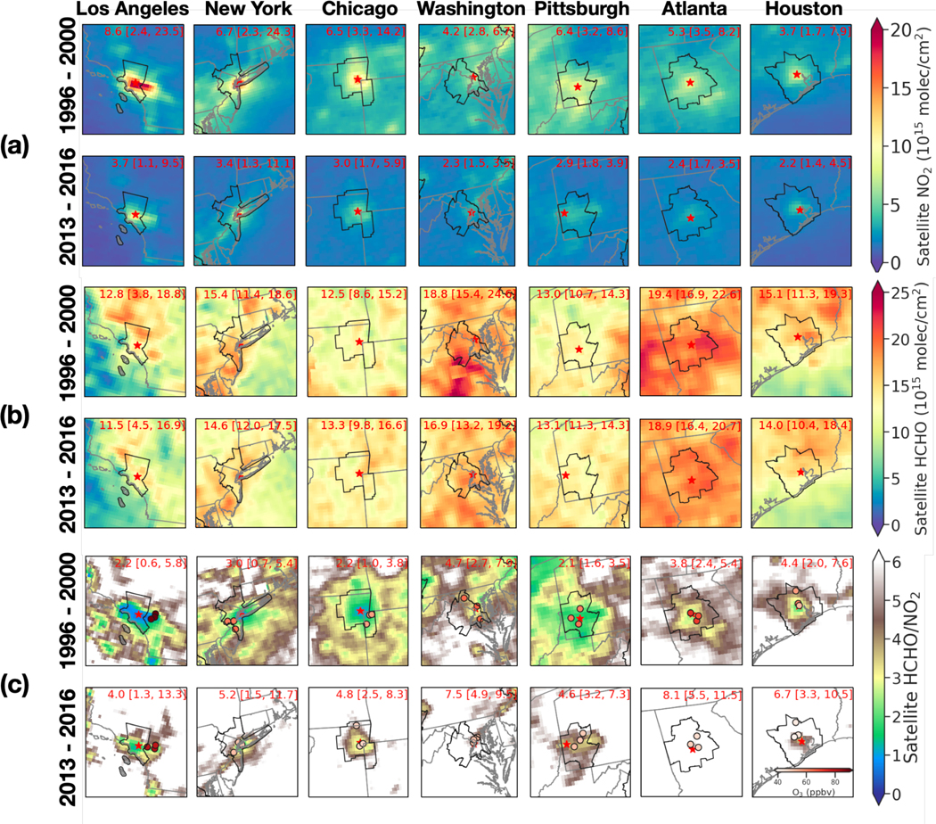
Figure 2.
Maps of summertime average: (a) satellite-based ΩNO2, (b) ΩHCHO and (c) HCHO/NO2 for seven cities (New York, Los Angeles, Chicago, Washington DC, Pittsburgh, Atlanta and Houston) in 1996 – 2000 and 2013 – 2016. The white area in (c) indicates HCHO/NO2 above 6. The numbers show the mean and the range of ΩNO2, ΩHCHO, and HCHO/NO2 for each core-based statistical area (CBSA, outlined in black). The red star shows the location with highest ΩNO2 in the CBSA. The red circles in the bottom two rows label the locations of three AQS sites where the highest O3 occurred in the region, and the color represents the summertime mean O3 (color bar inset in bottom right panel). Maps for 2001 – 2004, 2005 – 2008, and 2009 – 2012 are shown in Figure S11.

