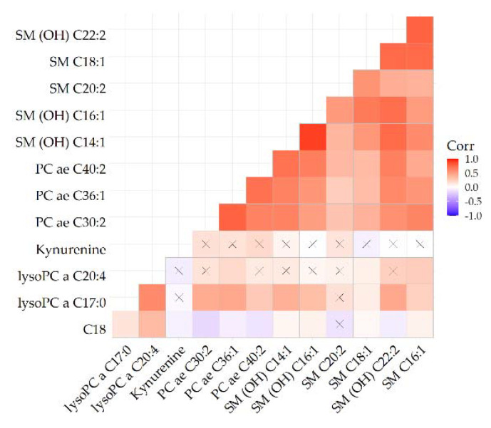
Figure 3.
Heatmap depicting correlations of metabolites identified in Figure 1. For reference, blue indicates an inverse and red indicates a direct association. The stronger the color the stronger the correlation. Crossed cells indicate a non-significant correlation.

