. 2021 Mar 2;10:e64618. doi: 10.7554/eLife.64618

Figure 7. Visualisations of SARS-CoV-2 clusters among care home residents.

Transmission networks were produced using a derivative of the transcluster algorithm, which incorporates pairwise date and genetic differences to estimate the probability of cases being connected within a defined number of intermediate hosts. Clusters were defined using a probability threshold of >15% for cases being linked by <2 intermediate hosts (further details in Materials and methods). (A) Transmission clusters for the ten care homes with the largest number of care home residents with available genomes. Consistent with Figure 6, several of the 10 care homes with the largest number of genomes comprised single transmission clusters (e.g. CARE0314), while others contained two or more clusters consistent with multiple independent transmission sources among the residents. These data alone do not indicate where the residents acquired their infections, and hospital-acquired infections for some of the clusters is a possibility alongside multiple introductions into the same care homes. (B) Visualisation of transmission links between residents of two nearby carehomes and a group of healthcare workers (HCW). Two care homes, CARE0063 (blue) and CARE0273 (orange), each had strong transmission links identified with the transcluster algorithm to a group of HCW (green). The HCW comprised paramedics and care home carers – one working at CARE0063 and the other working at an unknown care home. We do not have confirmatory epidemiological data available, but this raises the possibility of the cases sharing a linked transmission network.

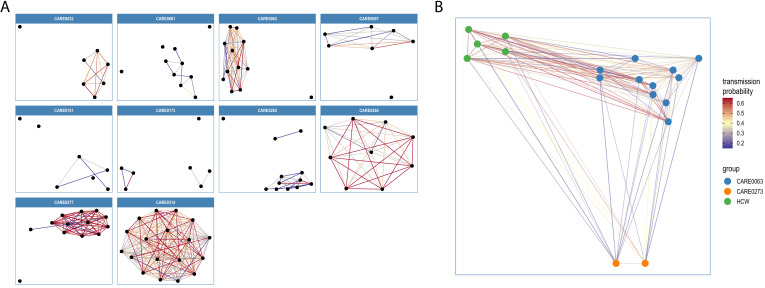
Figure 7.

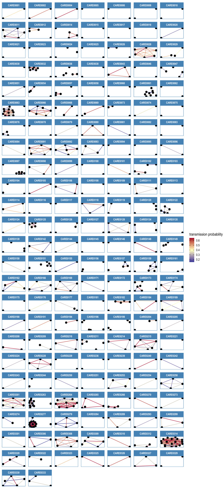
Figure 7—figure supplement 1. Transmission network diagrams for all care homes with two or more cases with genomic data.

Figure 7—figure supplement 1.

Transmission networks were produced using a derivative of the transcluster algorithm, which incorporates pairwise date and genetic differences to estimate the probability of cases being connected within a defined number of intermediate hosts. Clusters were defined using a probability threshold of >15% for cases being linked by <2 intermediate hosts (further details in Materials and methods). This figure displays data from all care homes with >2 samples with genomic data.
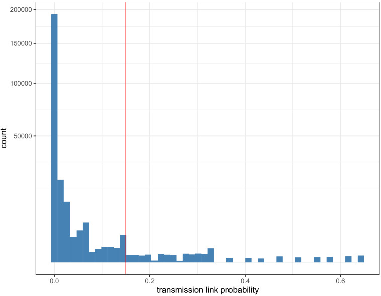
Figure 7—figure supplement 2. Histogram of pairwise transmission probabilities between care home samples.

Figure 7—figure supplement 2.

Histogram of the pairwise probabilities for cases being connected by <2 intermediate hosts for all 700 care home residents as inferred by the transcluster algorithm, with vertical red line at 0.15 showing the cutoff used to identify care home clusters in our analysis. Note the data gaps along the x-axis reflect the inherent discontinuity of the input datasets, measured in days and SNP differences between cases.
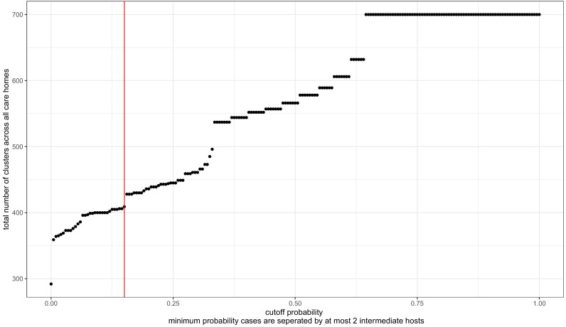
Figure 7—figure supplement 3. Transmission probability threshold vs number of care home clusters.

Figure 7—figure supplement 3.

The transcluster algorithm computes the likelihood of two samples being linked within a given number of intermediate hosts, based on the date and genetic differences between samples (assuming a given serial interval and mutation rate, further details in Materials and methods). Changing the probability threshold used to define clusters changes the number of clusters defined, with a higher threshold yielding more clusters (and higher likelihood of transmission within each cluster). The dataset analysed contained 700 genomes from residents in 292 care homes, and we treated each care home separately as microcosms of potential infection networks. Therefore, the highest theoretical number of clusters is 700, if every genome were its own cluster; and the lowest possible number of clusters is 292, if every person within each care home was part of the same cluster. The cut-off used (>15% probability of transmission with <2 intermediate hosts) is indicated by the red vertical line. This is arbitrary, and was selected (1) because the distribution of pairwise SNP and date differences within resulting clusters appeared reasonable (Figure 7—figure supplements 4 and 5) and because of a ‘jump’ in the number of clusters occurring at that point.
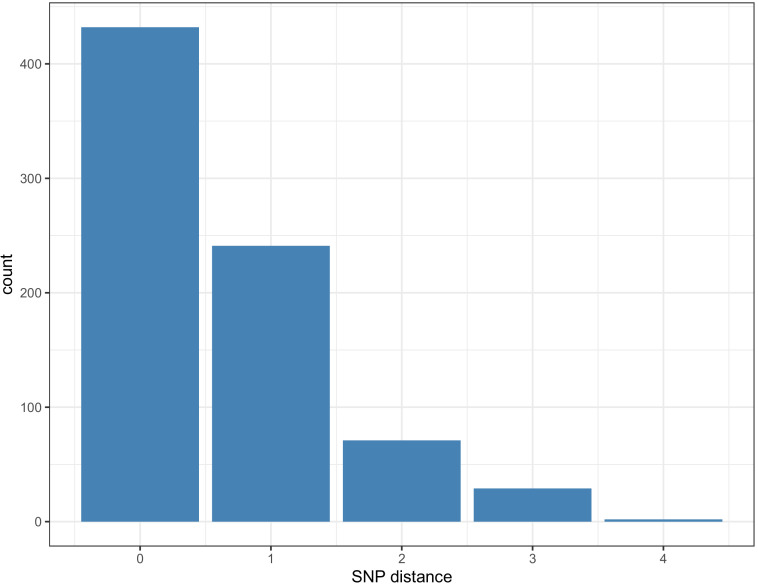
Figure 7—figure supplement 4. Pairwise SNP difference distribution between samples within clusters.

Figure 7—figure supplement 4.

Within each cluster, 673/775 (86.8%) of pairwise links that had a 15% probability of transmission with <2 intermediate hosts had 0 or one pairwise SNP differences (maximum 4).
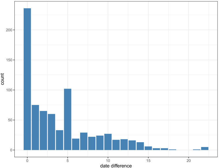
Figure 7—figure supplement 5. Pairwise date difference distribution between samples within clusters, aggregated across dataset.

Figure 7—figure supplement 5.

Within each cluster, 756/775 (97.5%) of pairwise links that had a 15% probability of transmission with <2 intermediate hosts cases were sampled <14 days apart (maximum 22 days).
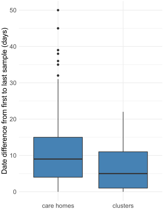
Figure 7—figure supplement 6. Distributions of date ranges (from first to last sampling dates) for care homes vs clusters.

Figure 7—figure supplement 6.

Date ranges were calculated by subtracting the date of the first sample from the last sample for each care home (left) or cluster (right). Care homes and clusters were only included in this analysis if there were >2 samples with available genomic data in that care home or cluster. Of 292, 170 (58%) care homes had two or more cases with genomic data (578 individuals), compared with 133/409 (33%) clusters (424 individuals). Using these datasets, there was a median of 9 days (IQR: 4–15, range: 0–50) from the first case to the last case within each care home, compared with 5 days (IQR: 1–11, range: 0–22) from the first case to the last case within each cluster (p=9.2e-06, Wilcoxon rank sum test). As expected, the transcluster algorithm produces clusters with a narrower and smaller date range between samples than for the care homes as a whole. Collection date was used for sample dates; if collection date was missing then receive date in the laboratory was used instead.
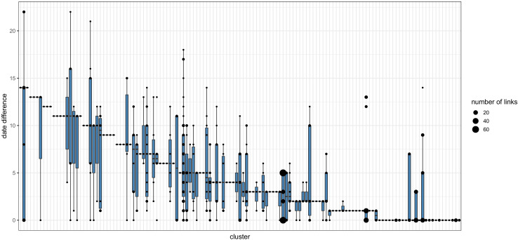
Figure 7—figure supplement 7. Pairwise date difference distribution between samples within each cluster.

Figure 7—figure supplement 7.

Boxplots indicate the median and interquartile ranges for the number of days separating samples found to be within the same transmission cluster by the transcluster algorithm. The boxplots are overlaid with points representing the underlying transmission links. Larger points are used to represent cases where many transmission links within a cluster are separated by the same number of days.