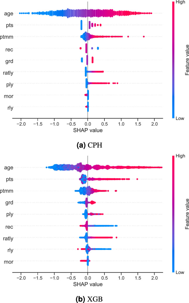
Figure 2.

Summary plots for SHAP values. For each feature, one point corresponds to a single patient. A point’s position along the x axis (i.e., the actual SHAP value) represents the impact that feature had on the model’s output for that specific patient. Mathematically, this corresponds to the (logarithm of the) mortality risk relative across patients (i.e., a patient with a higher SHAP value has a higher mortality risk relative to a patient with a lower SHAP value). Features are arranged along the y axis based on their importance, which is given by the mean of their absolute Shapley values. The higher the feature is positioned in the plot, the more important it is for the model.
