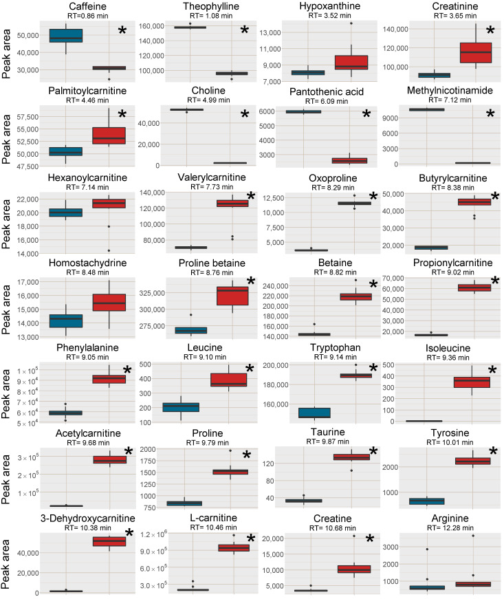
Figure 2.
Box plots of the peak area of [M+H]+ (or [M ]+ where applicable) of all investigated analytes in the plasma samples, red box=SPE MCX, blue box = PPT. The outer edges of the boxes represent the first and third quartiles respectively while the middle line represent the median and outliers are denoted by dots in the plots. Analytes with statistically different peak area (p < 0.05 in a unpaired t-test with bonferroni correction applied) between the two sample treatments are marked with a * in the top right corner of each individual box-plot.

