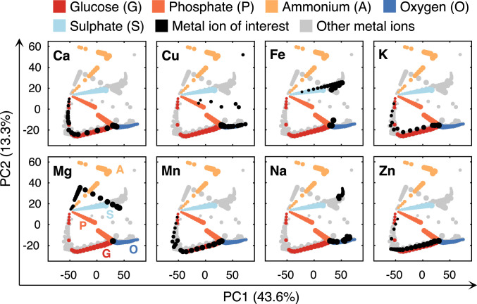
Fig. 3.
PCA of flux distributions under reduced availability of eight metal ions, four nutrients, and oxygen. Each dot represents a simulated flux distribution. The dots in the same color (except gray) represent the flux distributions of changed uptake rates of a certain metal ion, nutrient, or oxygen, which were from 100 to 5% of the optimum, represented by dot size (i.e., 100% corresponds to the largest while 5% the smallest). In each subplot, the flux distributions of the metal ion of interest are marked in black, while gray dots represent the other metal ions.

