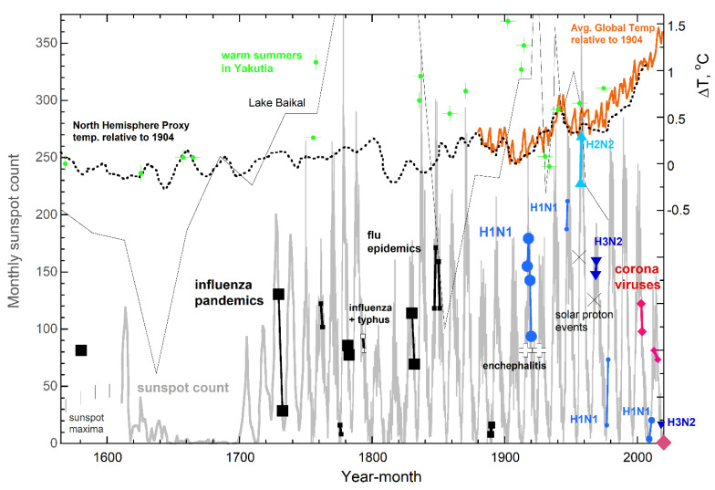
Figure 2.
Comparison of pandemic onset and duration with solar phenomena and warming episodes. These correlations that began with the “first” influenza pandemic of 1580. Grey curve (left y axis) = sunspot number from [67] and Hoyt and Schatten [60], where vertical bars denote earlier maxima from Wu [63]. X = strong solar cosmic ray events [68,69]. Major pandemics (large symbols) from [1,14] plus substantial or notable epidemics (various small symbols, with labels from [70]) are placed on the sunspot curve to best depict timing. Sizes of the symbols suggest severity, e.g., the 1889 pandemic was mild. The earlier SARS and MERS are actually epidemics, but are included, being related to the ongoing pandemic. Orange solid curve (right axis) = the global temperature difference from NOAA [71]. Dotted curve = decadal averages for the NH [66]. Thin black curve = summer temperatures from insects in lake sediments near Lake Baikal close to Mongolia [64]. All curves assume ΔT is 0 °C at 1904. Green + = hottest summers within 600 years from analysis of tree ring growth near the edge of permafrost [65]; vertical placement was ascertained by subtracting 10.5 °C from values in their tables, which reference value was estimated as the 1904 actual temperature in Yakutia from [65] (Figure 5).

