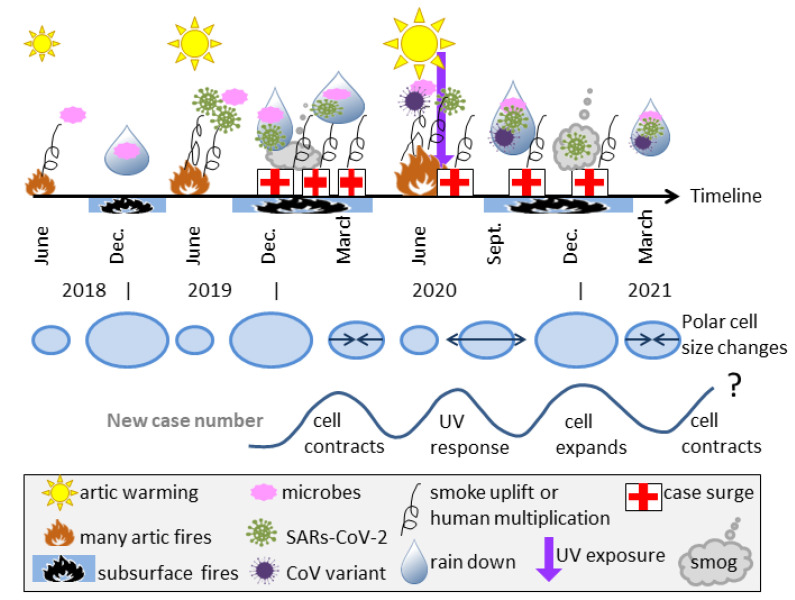
Figure 9.
Schematic of the proposed time evolution for COVID-19 in the Northern Hemisphere. The date line is non-linear and approximate. Top row of symbols shows the inferred timing of various natural processes, where the symbols are described in the legend (grey box at bottom). Middle row of blue ovals shows the sizes of the North Polar cell connected with seasons, and whether it is expanding or contracting (arrows). Grey curve shows the wavelike number of case increases and how these are connected with the Polar cell cycles and human UV response. However, the UV peak is only expected for areas with seasonal UV changes. In our model, cyclically occurring natural processes both lead up to the pandemic and promote its longevity. Major pandemics are rare because once any given region of permafrost is melted and releases its particular microbes, this locality is depleted.

