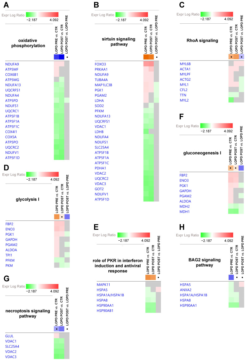
Figure 4.
Gene heatmap enables to visualize protein expression data in a specific canonical pathway, across multiple analyses at one time. (A) Oxidative phosphorylation. (B) Sirtuin signaling pathway. (C) RhoA signaling. (D) Glycolysis I. (E) Role of PKR in interferon induction and antiviral response. (F) Gluconeogenesis I. (G) Necroptosis signaling pathway. (H) BAG2 signaling pathway. Green and red colors refer respectively to decrease or increase for each individual protein statistically changed in our proteomics dataset. Grey color indicates changes that are statistically not significant for p-value (ANOVA followed by Tukey’s post-hoc test (p < 0.05)). Dots indicate non-significant values for z-score (z-score ≥ 2, ≤ −2).

