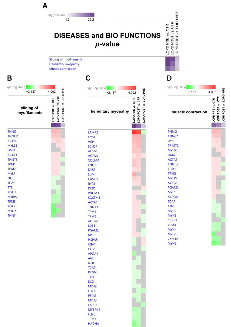
Figure 5.
(A) Diseases and bio functions heatmap displaying the most significant results (p-value, Table S5) across datasets in LOPD PRE vs. CTR, LOPD POST vs. CTR, and LOPD POST vs. LOPD PRE. (B,C,D) Gene heatmap enables to visualize protein expression data in a specific disease and biofunction, across multiple analyses at one time. Green and red colors refer to decrease or increase for each individual protein statistically changed in our proteomics dataset. Grey color indicates changes statistically non-significant for p-value (ANOVA followed by Tukey’s post-hoc test (p < 0.05)). Dots are non-significant values for z-score (z-score ≥ 2, ≤ −2).

