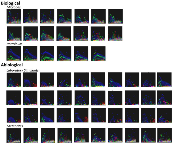
Figure 3.
Plots of binned and normalized spectra for the samples studied here. The X-axes show the 32 binned values over the range of m/z = 150–750, the Y-axes show the 32 binned normalized signal intensities. Colors represent KMD-binned data points, with bins 2, 3, and 4 represented as red, green, and blue, respectively; when the values for the KMD-binned data points are similar the colors blend or appear white. The choice of these three KMD bins for the visualization provided by this figure is arbitrary, there are multiple permutations by which three out of five KMD bins could be presented. This figure presents only a subset of the binned data considered by the algorithms to show how the data is condensed before classification. The individual sample source data for these plots can be found in the SI.

