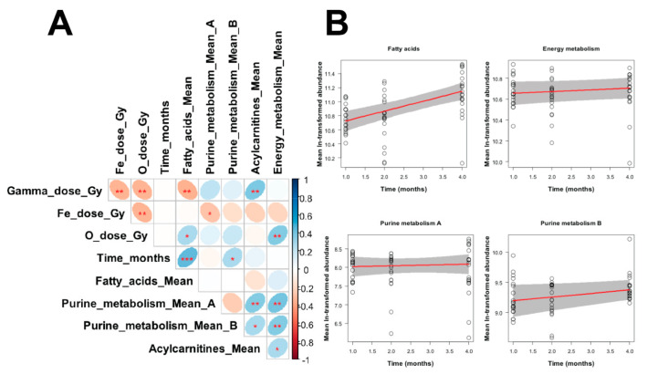
Figure 6.
(A) Matrix of Pearson correlation coefficients between all variables in the analyzed data set. The meanings of all variables are provided in the main text, and a color-coded correlation scale is provided on the right of the plot. Blue ellipses represent positive correlations, and red ones represent negative correlations. Darker color tones and narrower ellipses represent larger correlation coefficient magnitudes. Red star symbols indicate statistical significance levels: *** indicates p < 0.001, ** indicates p < 0.01, * indicates p < 0.05, no stars indicates p > 0.05. These p values here are intended only for visualization: since the correlations are pairwise, without correction for multiple testing, only 3 star significance levels are likely to indicate strong associations. Blank squares indicate correlation coefficients close to zero. (B). Visualization of robust regression results for selected metabolite groupings vs. time after irradiation. Circles represent data points (mean ln-transformed signal intensities). Red lines represent regression fits, and grey shaded regions indicate estimated 95% confidence bands.

