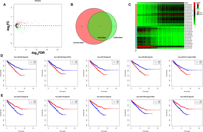
Figure 7.
The correlation between CD248 and miRNA (A) The volcano plot of DEmiRNA. Red, green, and black dots represent upregulated, downregulated, and unchanged genes, respectively. (B) The Venn diagram of PDEmiRNA (C) The heatmap of the top 15 CD248-correlated PDEmiRNA (D) The Kaplan–Meier curve of the top five PDEmiRNA that positively correlated with CD248 (E) The Kaplan–Meier curve of the top five PDEmiRNA that negatively correlated with CD248. The median expression level of PDEmiRNA was used as the cut-off value. p < 0.05 was considered statistically significant.

