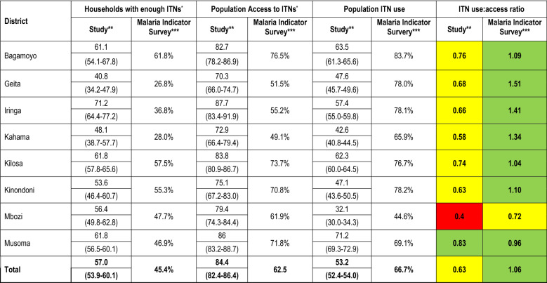
Table 2.
Comparison of ITN use and access indicators across study districts in 2015, 2 years after study ITN distribution versus Tanzania Malaria Indicator Survey in 2017, 2 years after the universal replacement campaign
*Assuming each net is used by 2 people
**Denominator is 7650 ITNs (study and non-study ITNs) found in all participating households
***Findings from the 2017 Tanzania Malaria Indicator Survey (TMIS)[14]
****Colour codes for use: access ratio: Green = good (≥ 0.80); Yellow = below target level (≥ 0.60– < 0.80); Red = poor (< 0.60)

