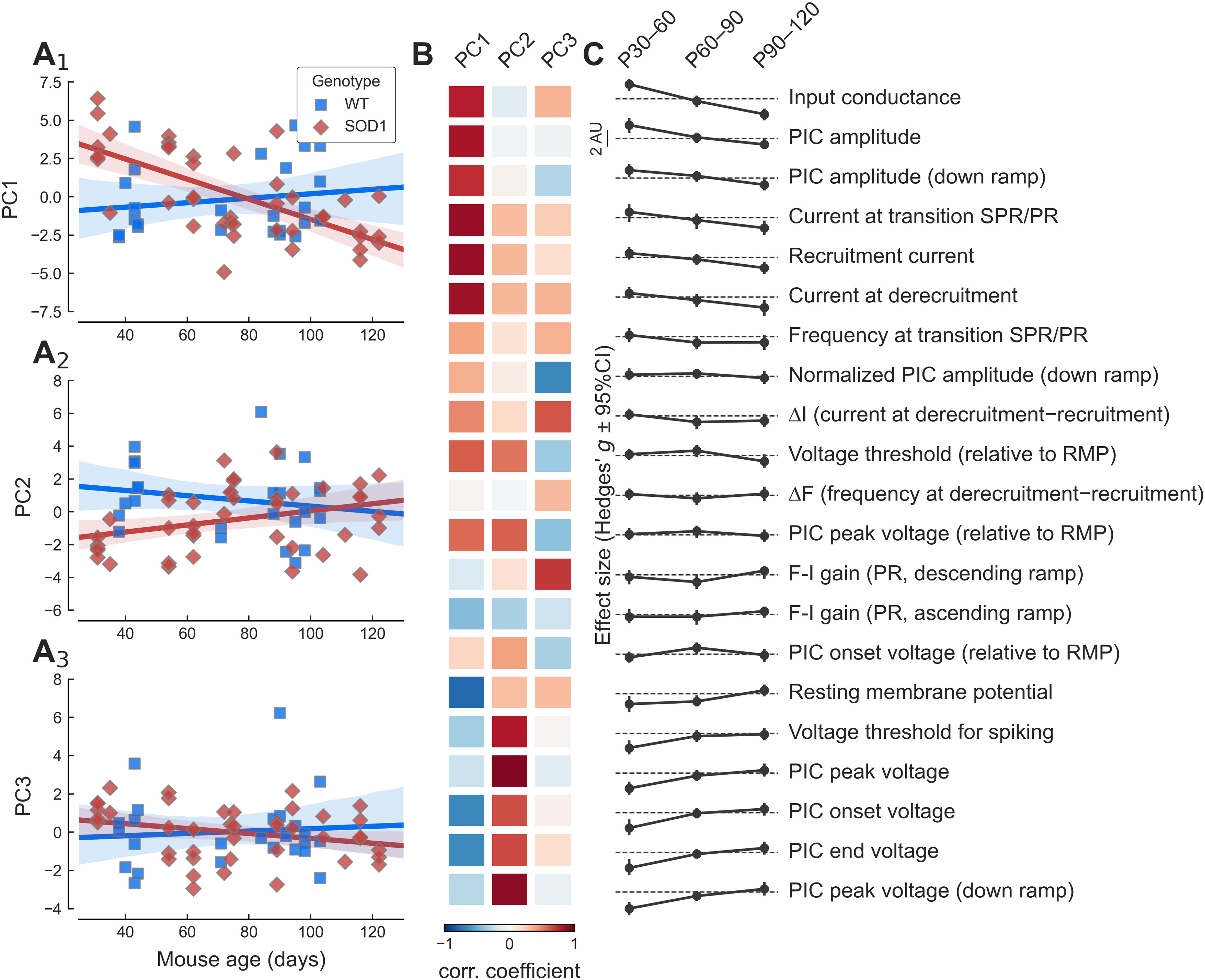
Figure 7.

Overview of the change in PCs over time. A1–A3, Plot of the three first PCs versus age in WT (blue squares) and mSOD1 motoneurons (red diamonds). The solid lines correspond to the linear regression lines with 95%CIs (shaded areas). B, Heatmap showing the correlation coefficient between each PC (columns) and the features (rows) shown on the right. Correlation coefficients are color-coded from dark blue (r = −1) to dark red (r = +1). C, Summary of the evolution of the difference between WT and mSOD1 motoneurons (quantified by the effect size Hedges’ g) for each of the features and each of the time points considered. The features are ordered by the size of the effect of the mutation in the P30–P60 age group. On each row, the dashed line represents an effect size of zero. Scale bar: 2 units.
