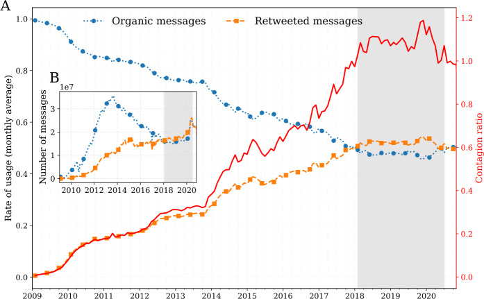
Figure 4.
Timeseries for organic messages, retweeted messages, and average contagion ratio for all languages. (A) Monthly average rate of usage of organic messages (, blue), and retweeted messages (, orange). The solid red line highlights the steady rise of the contagion ratio . (B) Frequency of organic messages (, blue), compared to retweeted messages (, orange). The areas shaded in light grey starting in early 2018 highlights an interesting shift on the platform where the number of retweeted messages has exceeded the number of organic messages. An interactive version of the figure for all languages is available in an online appendix: http://compstorylab.org/storywrangler/papers/tlid/files/ratio_timeseries.html

