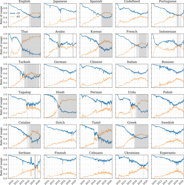
Figure 5.
Weekly rate of usage of the top 30 languages (sorted by popularity). For each language, we show a weekly average rate of usage for organic messages (, blue) compared to retweeted messages (, orange). The areas highlighted in light shades of gray represent weeks where the rate of retweeted messages is higher than the rate of organic messages. An interactive version featuring all languages is available in an online appendix: http://compstorylab.org/storywrangler/papers/tlid/files/retweets_timeseries.html

