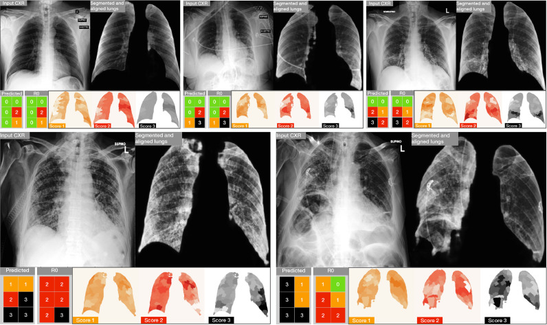
Fig. 10.
Results and related explainability maps obtained on five examples from the Brixia COVID-19 test set. (top) Three examples of accurate predictions. (bottom) Two critical cases in which the prediction is poor with respect to the original clinical annotation . For each block, the most left image is the input CXR, followed by the aligned and masked lungs. In the second row we show the predicted Brixia score with respect to the original clinical annotation and the explainability map. In such maps the relevance is colored so that white means that the region does not contribute to that prediction, while the class color (i.e., 1 = orange, 2 = red, 3 = black) means that the region had an important role in the prediction of the T score class.

