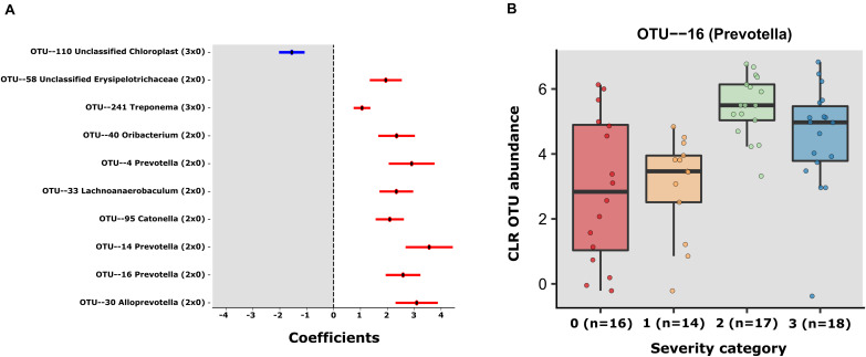
FIGURE 2.
(A) Error bar plot of the GLM coefficients interval for each OTU. The Y-axis shows the OTU number and Genus classification. The X-axis represents the CLR abundance variance explained by the GLM models. In red the positively associated OTUs with severity state (ranging from group 1 to 3) and in blue OTUs the negatively associated with severity state OTUS. (B) The centered log- transformed (CLR) OTU 16 (Prevotella) abundance in the severity groups 0–3, showing its higher abundance in severity categories.

