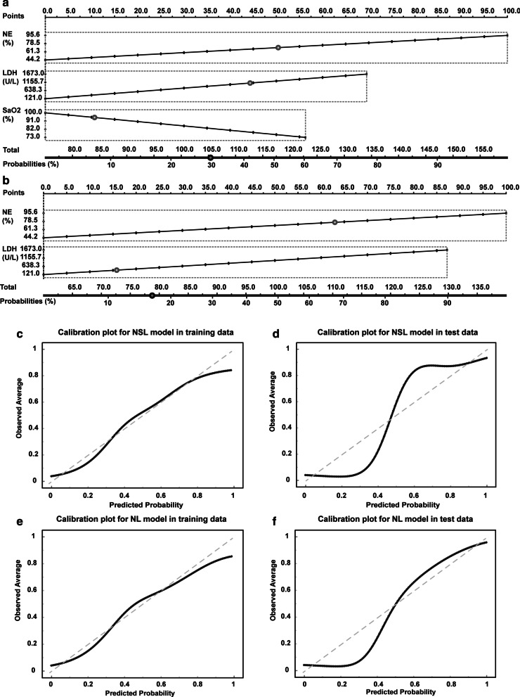
Fig. 3.
Nomograms for integrated models to predict hospital mortality and d the corresponding calibration plots. Nomgrams of the NSL model (a) and NL model (b) to estimate the risk of death in severe patients with COVID-19. Calibration plot showing the probability of death. Plots for NSL model in training (c) and test dataset (d). Calibration plots for NL model in training (e) and test dataset (f). The nomogram-estimated mortality is plotted on the x-axis, and the actual mortality is plotted on the y-axis. The diagonal dotted line is a perfect estimation by an ideal model. The solid lines are the performance of the nomogram, and closer alignment with the dashed diagonal lines indicates a better estimate

