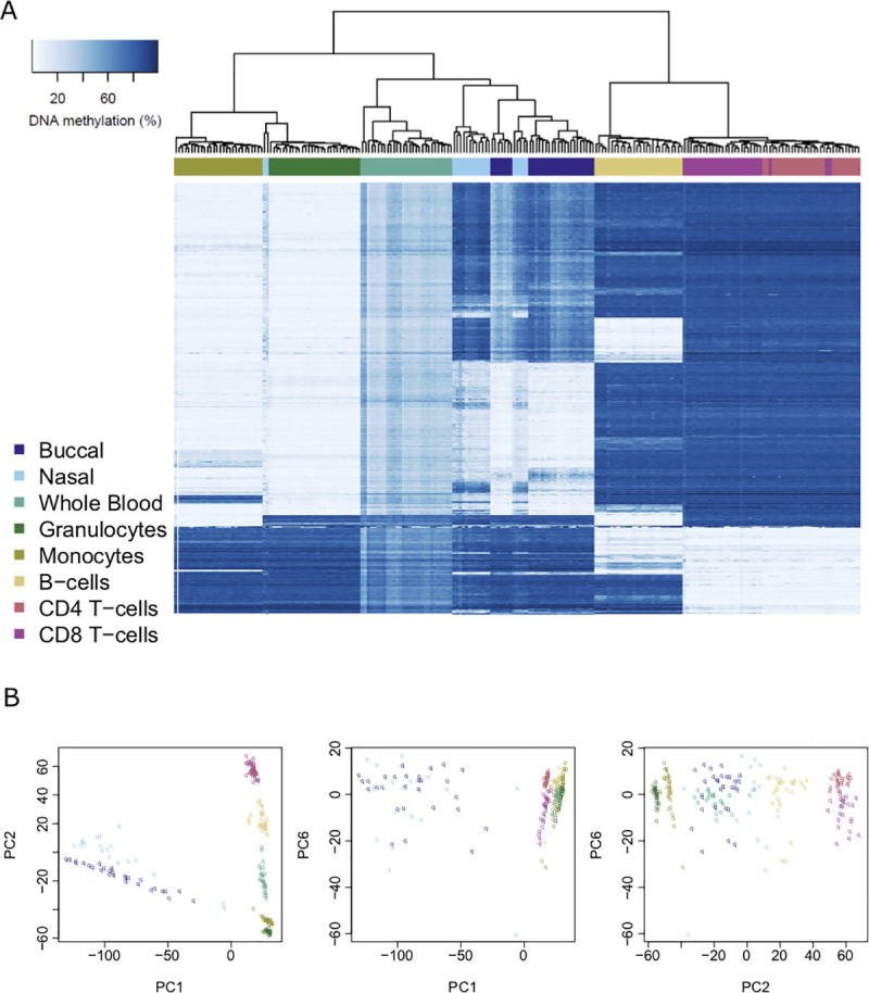
Fig 1. Major axes of variation in DNA methylation data are driven by sample origin.

A) Heatmap of DNA methylation values across purified cell types and peripheral tissues for the top 1000 most variable sites (ranked by standard deviation). Each row depicts data for an individual DNAm site, and each column depicts data from one individual sample. The order of rows and columns was determined by hierarchical clustering to group together similar profiles of DNA methylation. Low levels of DNA methylation are represented by white boxes and high levels of DNA methylation represented by blue boxes. The colored bars across the top of the columns depict different sample types. B) Scatterplots of the three principal components (first, second and sixth) that optimally separate different sample types. Each point represents a sample and the color of the point indicates the specific sample type. The different panels represent different orientations of the same dataset.
