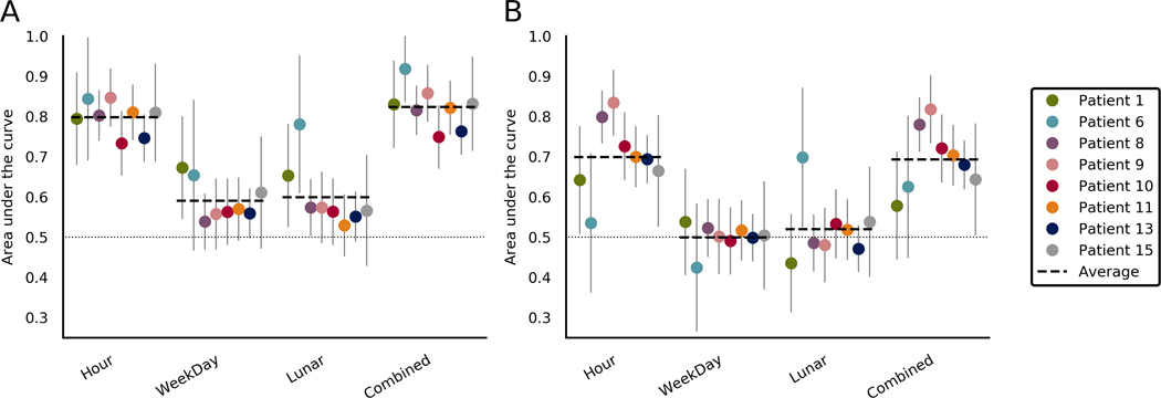
FIGURE 5.
Comparison of area under the curve (AUC) scores when forecasting using temporal features in the (A) training set and (B) testing set. Each section represents a different temporal feature. The final section shows scores when the forecasts from all temporal features were combined. Average lines indicate the average for that feature across patients. Chance performance is .5, as indicated by the dotted line. Error bars represent the upper limits of the confidence interval of each AUC score

