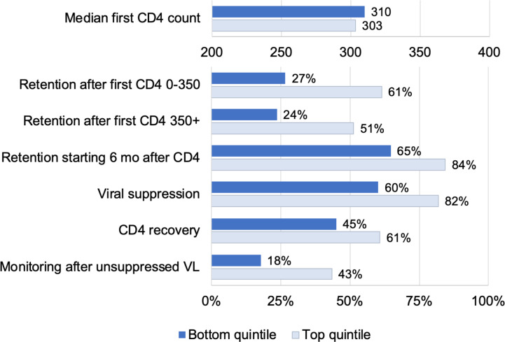
Fig 3. Quality of care at facilities in the top (light blue) versus bottom (dark blue) quintiles.
The figure displays HIV care quality indicators for facilities with quality scores in the top 20% and bottom 20% of the distribution. All indicators are estimated from the NHLS Cohort and are described in the text.

