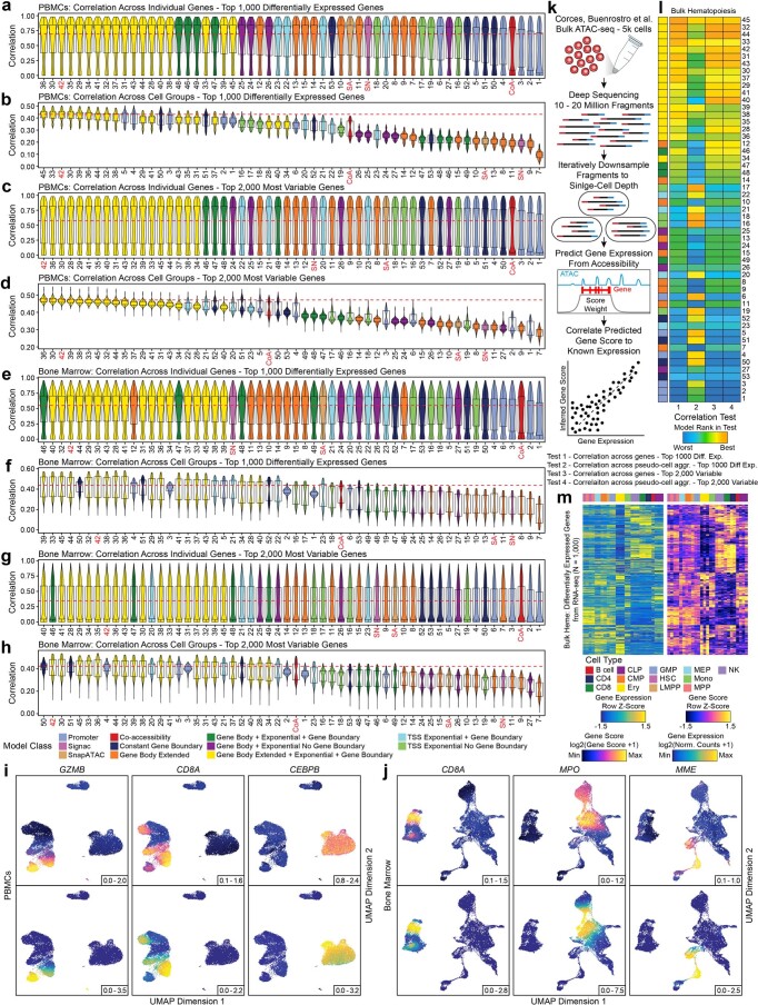
Extended Data Fig. 6. Assessment of gene score models.
a-h, Distribution of Pearson correlations of inferred gene score and aligned gene expression for (a,c,e,g) each gene or (b,d,f,h) each cell group across groups of 100 cells (N = 500 groups). Distributions are either presented for (a,b,e,f) the top 1,000 differentially expressed genes or (c,d,g,h) the top 2,000 most variable genes for each of the 56 gene score models. The red dotted line represents the median value of the best-performing model. Violin plots represent the smoothed density of the distribution of the data. In box plots, the lower whisker is the lowest value greater than the 25% quantile minus 1.5 times the interquartile range, the lower hinge is the 25% quantile, the middle is the median, the upper hinge is the 75% quantile and the upper whisker is the largest value less than the 75% quantile plus 1.5 times the interquartile range. SA, SnapATAC; SN, Signac; CoA, Co-accessibility. i-j, UMAPs of scATAC-seq data from (i) cells from the PBMCs dataset (N = 27,845 cells) or (j) cells from the bone marrow cell dataset (N = 26,748 cells) colored by (top) inferred gene scores or (bottom) gene expression for several marker genes. k, Schematic illustrating the methodology used to assess the accuracy of inferred gene scores. l, Heatmaps summarizing the accuracy (Pearson correlation) across all models for both the top 1,000 differentially expressed and top 2,000 variable genes for bulk ATAC-seq and RNA-seq from hematopoietic cell types. Each entry is colored by the model rank in the given test as described below the heatmap. The model class is indicated to the left. SA, SnapATAC; SN, Signac; CoA, Co-accessibility. m, Heatmaps of (left) gene expression or (right) gene scores for the top 1,000 differentially expressed genes (selected from bulk RNA-seq) across all cell types from the matched bulk ATAC-seq and RNA-seq data.

