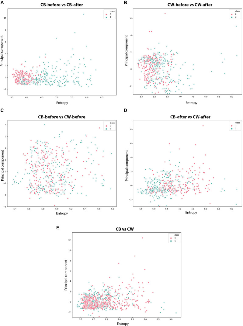
FIGURE 11.
Scatter plots for the different time series analysed. (A,B): red dots represent the values before the presentation to the host; blue dots represent the values after the presentation to the host. (C–E): red dots represent dodders presented to beans, blue dots represent dodders presented to wheat plants.

