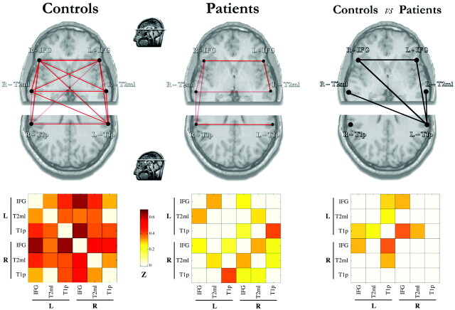
Fig 2.
Plots and matrices representing FC links among the 6 language-network regions in both hemispheres evaluated in this study (left panel) in controls (n = 12) and all patients (n = 22). Connectivity plots (upper row) show statistically significant correlations by means of red lines of variable thickness according to the z scores, from Pearson coefficient values. These are further represented in the corresponding color-coded matrices (lower row), ranging from white (z = 0) to dark red (z = 0.7). Only correlations significant at P < .01 are shown. The right panel shows a statistical comparison between the groups (independent t test, P < .01). Significantly reduced FC links in patients are indicated by black lines and quantified in the corresponding color-coded matrices (color scale for z score representation is the same as that in the left panel). Line thickness varies according to the reduction of correlation values.

