
Figure 2.
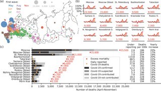
(a) Excess mortality (April to November 2020) in each of the 85 Russian federal regions. The area of each bubble corresponds to the number of excess deaths. The colour corresponds to the month when excess mortality exceeded the baseline by more than 25% for the first time (see legend). See also an animation and further figures at github.com/dkobak/excess-mortality. (b) Time series of excess mortality in the 15 regions with the highest overall excess mortality. (c) Number of Covid-19 deaths (April to November 2020) for the same 15 regions as in (b) measured in six different ways: excess mortality (red dots), daily reported Covid-19 deaths (orange dots), and four categories of monthly reported Covid-related deaths (shades of grey). Columns on the right: Underreporting = ratio of excess mortality to the daily reported deaths; Deaths per 100k = number of excess deaths per 100,000 population; Yearly increase = increase in mortality relative to baseline value for the entire 2020. Among the regions not shown here, the largest yearly increases were in Chechnya (37%) and Dagestan (30%).