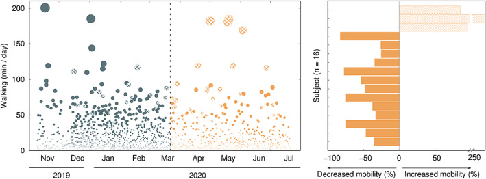
FIG. 1.

Left, daily accumulated walking minutes per individual. Right, percentage of change in walking activity associated with COVID‐19 confinement. Gray (orange) dots stand for the period before (during) confinement. Uniformly filled circles and bars stand for individuals with decreased walking activity because of COVID‐19, whereas the oblique stripe pattern corresponds to individuals with increased walking activity.
