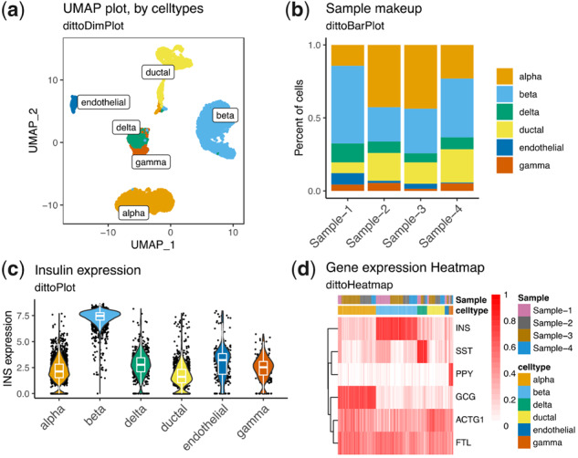
Fig. 1.

dittoSeq offers a plethora of highly customizable visualization options. Data for these figures come from Baron et al. (2016), subset to only some of the most common cell types for simplicity, then processed with a standard Seurat workflow. Plots were made with (a) dittoDimPlot, (b) dittoBarPlot, (c) dittoPlot and (d) dittoHeatmap. Data are available in the Gene Expression Omnibus at www.ncbi.nlm.nih.gov/geo and and can be accessed with GSE84133.
