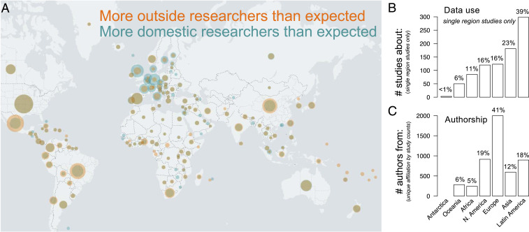
Fig. 2.
Geography of GBIF data use and authorship. World map (A) highlights disparities between country-level biodiversity data use and author affiliation. The map overlays two normalized datasets: orange circles indicate country-level biodiversity data use, and teal circles indicate country-level author affiliations. Circle sizes are proportional to the maximum value in each dataset. Researcher affiliation (teal) is overlaid atop research coverage (orange), mixing to form brown where they overlap. Wider teal rings indicate disproportionately higher number of researchers than research specific to that country (e.g., United Kingdom), whereas wider orange rings (e.g., Mexico) indicate the opposite. Brown circles with no external rings indicate a proportionally similar number of studies about a given country to authors from a given country (e.g., United States). Bar charts show the corresponding frequency of studies published in 2016 to 2019 about a specific region, excluding global studies (B) and the frequency of authorship from each region (C; unique country-level affiliation by study counts). GBIF regions follow ref. 63.

